Author: Huang Publish Time: 23-02-2026 Origin: Site


 1. What LED color temperature means and why it matters
LED color temperature, often labeled CCT and measured in kelvin (K), describes how “warm” or “cool” the light looks to the eye. Lower numbers feel warmer and amber, while higher numbers appear cooler and more like daylight. The CIE defines correlated color temperature precisely as the Planckian‑based match of a source’s chromaticity, and it’s reported in kelvin.
▍CCT isn’t color quality. Color quality is described by CRI or IES TM‑30, which tell you how faithfully colors render at a chosen CCT. In practice, you’ll pick a CCT for the ambience and task clarity you want, then confirm color quality is good enough for the application.
Warm, neutral, and cool bands most people use:
Warm white: 2700–3000K
Neutral white: 3500–4000K
Cool white: 5000–6500K
Quick rule of thumb: relaxing spaces lean warm, precision tasks lean neutral to cool. But always judge CCT together with illuminance, glare control, and color quality.
| Space snapshot | Typical CCT range | Why this works |
Living room | 2700–3000K | Cozy, relaxing ambience |
Bedroom | 2700–3000K | Wind‑down friendly, dimmable |
Kitchen ambient | 3000–3500K | Balanced comfort and clarity |
Kitchen task | 3500–4000K | Neutral for food prep |
Bathroom ambient | 3000–3500K | Comfortable, not clinical |
Vanity task | 3000–3500K with CRI ≥90 | Natural skin tones |
Hotel lobby and corridors | 3000–3500K | Warm welcome, clear wayfinding |
Guest rooms and dining | 2700–3000K | Restful and flattering |
Retail floor | 3000–4000K | Inviting yet crisp |
Open office | 4000–5000K | Focus and clarity, watch glare |
Meeting rooms | 3500–4000K | Collaborative feel |
Classrooms | 3500–4000K or tunable | Flexible learning tasks |
Warehouse aisles | 4000–5000K (up to 6500K) | Vertical visibility |
Inspection zones | ~5000K | Fine discrimination |
▍Tip: CCT choice depends on finishes, daylight, and glare. According to DOE’s color and spectrum guidance, you should consider CCT alongside illuminance and distribution rather than in isolation.
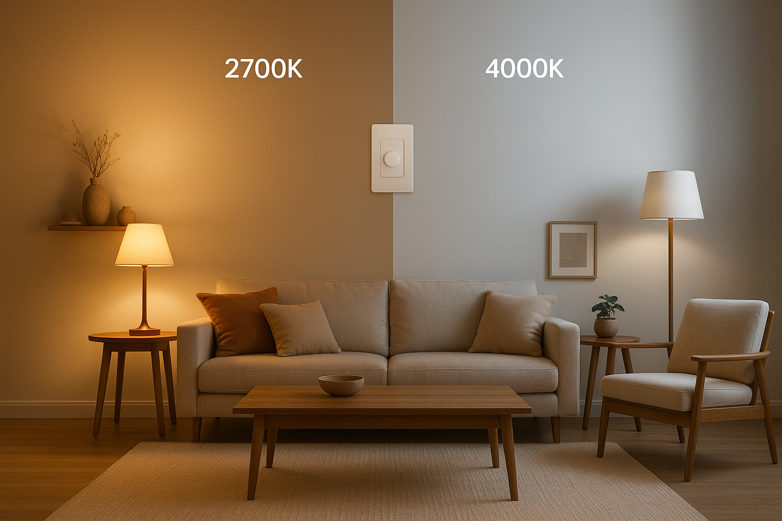
Recommended CCT: 2700–3000K warm white
Why: Creates a welcoming, relaxing feel and flatter wood and warm finishes
Do this: Use dimming for evening scenes; layer accent lights at the same CCT
Watch out: Mixing 3000K and 4000K in a small room can look disjointed
Recommended CCT: 2700–3000K warm white
Why: Supports calm, comfortable wind‑down lighting
Do this: Keep bedside and ceiling fixtures matched in CCT; add warm task spots for reading
Watch out: Very cool CCTs (5000–6500K) may feel harsh at night
Ambient CCT: 3000–3500K neutral‑warm
Task CCT: 3500–4000K neutral for prep areas
Why: Neutral tones improve contrast on counters without feeling clinical
Do this: Coordinate under‑cabinet lights with ceiling fixtures; ensure good CRI for food colors
Watch out: Cooler light doesn’t equal more brightness if lumens are the same
Ambient CCT: 3000–3500K
Vanity task: 3000–3500K with CRI ≥90 for natural skin rendering
Why: Neutral‑warm tones reduce harshness and improve grooming accuracy
Do this: Place lights to minimize shadows on the face; match mirror lights to ceiling CCT
Watch out: CCT is separate from moisture protection. For protection levels, see our guide on IP ratings for office, corridor, and damp areas
Lobbies and corridors: 3000–3500K
Guest rooms and dining areas: 2700–3000K
Back‑of‑house tasks: 4000–5000K
Why: Warm public zones feel welcoming; task zones need clarity
Do this: Use scenes with dimming for time‑of‑day shifts; keep public areas consistent per zone
Watch out: Over‑cool lighting in lounges can feel uncomfortable and reduce dwell time
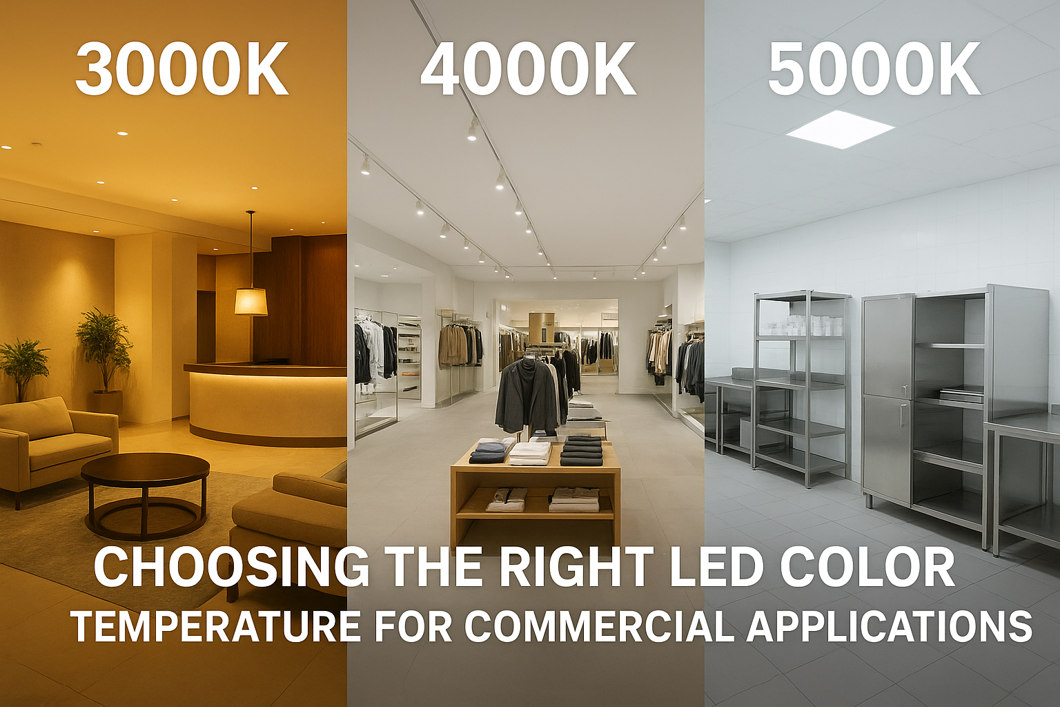
General sales floor: 3000–4000K
Color‑critical displays: choose CCT for brand look and pair with CRI ≥90 or TM‑30 Rf ≥90
Why: Neutral ranges balance inviting ambience with crisp product visibility
Do this: Test a sample bay at 3000K, 3500K, and 4000K before rollout; use high CRI for apparel and cosmetics
Watch out: Don’t rely on CCT alone for “pop” — consider TM‑30 gamut control. For fundamentals, see our explainer on LED panel specs including CRI and dimming
Note: Standards like EN 12464‑1 emphasize illuminance, glare, and color rendering rather than prescribing CCT. A common comfort target for office workstations is UGR <19; see context in LightingEurope and CIBSE’s discussion of better lighting. Choose CCT within that comfort framework.

Recommended CCT: 4000–5000K neutral to cool
Why: Supports visual clarity and alertness for screens and paperwork
Do this: Combine proper illuminance with low‑glare optics; consider panels or linear lights with UGR control. For practical selection, see LED panel lights usage and selection
Watch out: Cooler CCT can feel stark if surfaces are highly reflective; test scenes first
Recommended CCT: 3500–4000K
Why: Slightly warmer neutral feels more comfortable for discussion and video
Do this: Add presets for presentation vs discussion scenes; align wall washers with table finishes
Watch out: Avoid mixing too many CCTs between pendants and downlights unless deliberately zoned
Classrooms: 3500–4000K fixed, or tunable 3000–5000K with presets
Labs and tech rooms: align with classroom ranges; prioritize CRI and illuminance
Why: Neutral tones balance clarity and comfort across tasks
Do this: If tunable, set simple presets (e.g., reading, discussion, test). DOE discusses tunable products in its color‑tunable overview
Watch out: Complex controls without training can confuse users; keep scenes simple

Recommended CCT: 4000–5000K for most aisles; up to 6500K in some high‑contrast tasks
Why: Neutral to cool light improves vertical visibility and identification of labels and rack faces
Do this: Consider reflectances and mounting heights; test a pilot aisle at two CCTs before large rollouts
Watch out: For retrofit planning and fixture type choices, see our guide on metal halide versus LED high‑bay for warehouses
Recommended CCT: around 5000K neutral‑daylight, with high CRI or TM‑30 fidelity targets
Why: Fine visual discrimination benefits from neutral daylight‑like tones and excellent color fidelity
Do this: Specify CRI ≥90 or TM‑30 Rf ≥90 where color judgments matter; verify uniformity across fixtures (≤3 SDCM if available)
Watch out: “Cooler” doesn’t guarantee better color; fidelity metrics matter as much as CCT
Disclosure: KEOU Lighting is our product.
Start neutral, then fine‑tune: Begin with 3500–4000K for most interiors, then adjust on site based on finishes and daylight. The DOE’s tunable product overview explains common 2700–6500K tunable ranges.
Use selectable‑CCT fixtures during commissioning: For example, a selectable‑CCT KEOU panel can be set to 4000K in an open office and 3500K in adjacent meeting rooms during handover, helping stakeholders compare scenes before locking in settings.
Pair CCT with color quality: Aim for CRI ≥80 for general spaces; use CRI ≥90 or TM‑30 Rf ≥90 in color‑critical retail displays, vanities, and inspection areas. For more on CRI and dimming trade‑offs, see our panel specs explainer
Control glare, especially at desks: Target low‑glare optics and suitable distributions; UGR context in offices often aims below 19 for comfort per LightingEurope and CIBSE’s guidance
Check color consistency: For multi‑fixture spaces, ask for chromaticity consistency data and bins around ≤3 SDCM to keep the space looking uniform
▍Next steps: If you’re planning a rollout, you can explore KEOU’s application guides and product pages to compare selectable‑CCT and low‑glare options without guesswork.
▍Mistake: Equating CCT with brightness
Quick fix: Compare lumen output and distribution; choose CCT for look and task, not brightness claims
▍Mistake: Mixing 3000K and 4000K randomly in a small room
Quick fix: Pick one CCT per room unless you’re deliberately zoning accent vs task areas
▍Mistake: Choosing very cool CCTs for relaxation zones
Quick fix: Keep bedrooms and lounges in the 2700–3000K band and use dimming for evening comfort
▍Mistake: Ignoring color quality for color‑critical tasks
Quick fix: Specify CRI ≥90 or TM‑30 Rf ≥90 in retail displays, vanities, and inspection points. For TM‑30 fundamentals, see the IES’s practical guide to using TM‑30
▍Mistake: Overlooking glare in offices
Quick fix: Choose optics and layouts that control glare; evaluate UGR context alongside your chosen CCT
Q1:What is CCT and how is it different from CRI?
CCT describes the apparent warmth or coolness of light in kelvin. CRI (or TM‑30) describes how accurately colors appear under that light. A space might be 3500K and still have poor color quality if CRI is low. For clear definitions, review the CIE term for correlated color temperature and DOE’s color and spectrum overview.
Q2:Does LED color temperature affect energy use?
Not directly at the same lumen output and efficacy. Perceived “brightness” changes with spectrum and surfaces, but watts per lumen are a product spec, not a function of CCT alone.
Q3:Can I mix 3000K and 4000K in one room?
Yes, if you’re deliberately zoning (e.g., 4000K task under‑cabinet, 3000K ambient). In small rooms, random mixing can look mismatched. Test scenes at both CCTs before deciding.
Q4:What specs matter besides CCT when I’m choosing fixtures?
Look at lumens, distribution, CRI or TM‑30, dimming compatibility, glare control, and color consistency (SDCM). For panel‑type fixtures and buying context, see our comparison of top panel brands and how to choose LED panel lights


